FrontPanel Classic
okToggleCheck (Wire In)
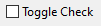
The okToggleCheck attaches to a Wire In component and behaves much like the okToggleButton except that graphically it appears as a checkbox with the label text on the right. When unchecked, the corresponding wire is unasserted (logic 0). When checked, the corresponding wire is asserted (logic 1).
| ELEMENT | TYPE | DESCRIPTION |
|---|---|---|
| position | POSITION | Position of the top left corner. |
| size | SIZE | Size in pixels. If no size is specified, the component is automatically sized. |
| label | TEXT | Label text, shown inside the button. |
| tooltip | TEXT | Tooltip text. |
| endpoint | HEX BYTE | Endpoint address for the corresponding Wire In. |
| bit | NUMBER | Bit to which this component addresses (0=LSB, 15=MSB). |
XML Example
<object class="okToggleCheck">
	<label>Autocount.</label>
	<position>20,135</position>
	<endpoint>0x00</endpoint>
	<bit>2</bit>
	<tooltip>Enable autocount.</tooltip>
</object>Code language: HTML, XML (xml)
Lua Scripting
This component behaves identically to okToggleButton from the scripting API point of view and can be used in exactly the same way, e.g.:
Lua:
function OnToggleCheck(check, event)
	if check:GetValue() then
		check:SetLabel("Checked")
	else
		check:SetLabel("Unchecked")
	end
endCode language: JavaScript (javascript)
All XML components that support Lua scripting also inherit from the Control class. Please refer to the FrontPanel Scripting documentation for more information on this class.
Example Screenshot